Published: 8 September 2026 | Author: Team JanVayu | Reading time: 8 min
Every winter somebody announces that Delhi's air has improved. Every winter somebody else announces that it has not. Both can point at real numbers.
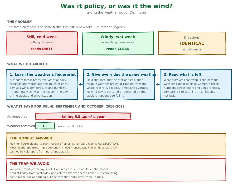
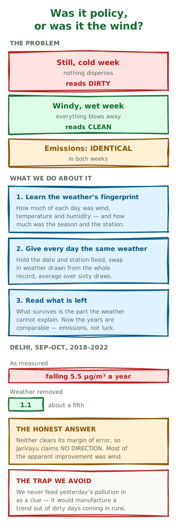
The reason they can is that the number everyone points at is not measuring only what they think it is measuring. A week of still, cold weather traps whatever the city emits close to the ground and the monitors read high. A week of wind and rain scatters the same emissions and the monitors read low. Nothing about the traffic, the kilns, the construction or the stubble has changed. The air is simply being counted under different conditions.
Until now JanVayu could not tell those apart, and we said so on the site. We led with annual averages partly because averaging over a year smooths out some of the weather. That is accurate, but it limits us: we could say what the air was and not why it changed.
Putting every day under the same weather
The technique is called meteorological normalisation, and the version we use comes from Grange and colleagues (2018) in Atmospheric Chemistry and Physics. It is also what Hawa Ka Hisab does, and reading their method is part of why we built ours.
The idea is simpler than the name. First you let a model learn how Delhi's daily PM2.5 responds to weather: wind speed, which direction the wind came from, temperature, humidity. You also let it learn the things that are not weather but do vary: the time of year, the day of the week, which station is reporting, and the slow drift across five years.
Then you do something slightly strange. You take a particular day, keep its date and its station exactly as they were, and give it somebody else's weather, drawn at random from anywhere in the five-year record. You ask the model what that day would have read. Then you do it again, sixty times, with sixty different weather draws, and average the answers.
What comes out is that day's reading as it would have been under ordinary weather rather than the weather it actually got. A day that got lucky with a strong westerly is no longer flattered. A day trapped under a November inversion is no longer punished. Compare those numbers across years and you are comparing emissions, with the luck of the weather taken out.
What we deliberately refuse to tell the model
There is an obvious way to make this model look much better, and it is a trap.
Air pollution is strongly autocorrelated: dirty days arrive in runs. If you let the model use yesterday's PM2.5 as a clue for today's, its accuracy leaps. It also becomes worthless for our purpose, because it is now predicting pollution from pollution. Whatever is left over gets labelled "the part weather cannot explain", and you have manufactured a confident trend out of nothing but the calendar.
So lagged pollutant values are not inputs. The model is allowed to know what the weather was doing and what day it was. It is not allowed to know what the air was doing.
The answer for Delhi, and why it is narrower than we wanted
Across September and October, from 2018 to 2022, at ten stations in Delhi-NCR:
| change per year | 95% interval | |
|---|---|---|
| As measured | −5.5 µg/m³ | −9.9 to +0.2 |
| With weather removed | −1.1 µg/m³ | −1.9 to +0.1 |
Read the first row and Delhi looks like it is improving briskly. Read the second and about four-fifths of that improvement turns out to have been the weather.
Then read the intervals, which matter more. Neither clears zero. So "Delhi improved a little" would overstate it: we cannot tell whether Delhi improved at all in those months, once the weather stops getting the credit.
That is a negative result and we are publishing it as one.
Why only September and October
Because that is where the data actually is, and pretending otherwise would have produced something much more satisfying and completely wrong.
Our first run compared plain annual averages of whatever days had reported. It produced a confident trend that was an artefact, a spurious one of the wrong sign. The station record has holes, and the holes are not spread evenly through the year. 2021 is missing April to August, its cleaner months, so its average was computed almost entirely from its dirty ones and came out at 137.6. 2022 is missing November and December, its two worst months, so its average came out at 82.2 (all-months annual means in /data/deweathered.json). Line those two up and you have invented a trend out of a filing gap.
Everything reported here is therefore restricted to the months present in every year, which turns out to be September and October. That is a narrower claim than we set out to make, and it is one the data supports.
There was a second trap underneath the first. OpenAQ's records for these stations advertise coverage from 2016 to 2026, which reads like a decade of continuous monitoring. It is not: it is the union of separate sensors with a gap of roughly 2.3 years in the middle, and at one station the "decade" turns out to be two sensors seven years apart. Taken at face value it would have given us a series with a hole in it and no error message anywhere.
How we know the model is not just making things up
A model can give a satisfying answer and still not work, so we tested it the way you test for self-deception: by giving it a problem that has no answer.
We took the PM2.5 readings and shuffled them against their dates at random, then asked the same model to learn from the nonsense. If it still scored well, something in our pipeline was leaking, the model would be finding structure that was not there, and every number above would be worthless.
On the real data it explains about 75% of the variation in held-out days. On the shuffled data it scores below zero, worse than guessing the average. That is what a clean pipeline looks like.
Two other checks. Weather alone, with no time information at all, predicts daily PM2.5 at about 0.70, which tests the premise of this whole exercise instead of assuming it: in Delhi, most of what a monitor reads on a given day is meteorology. And the adjustment removes 72% of the day-to-day variance, which is the weather being taken out.
All of these figures ship inside the data file itself, at /data/deweathered.json, along with the coverage gaps, the station list and the caveats. Our build refuses to publish the file at all if the shuffled-data score ever rises above 0.05.
What this does not say
It is Delhi-NCR only. Ten stations, one airshed, one window. Nothing here transfers to Kanpur or Patna or Bengaluru, and we are not going to imply that it does.
The 2020 lockdown (late March to May) falls outside the September to October window used here, but September to October 2020 was still the dirtiest of the five years in /data/deweathered.json. Normalisation removes weather; it does not remove changes in emissions, so whatever 2020 did to emissions stays in the adjusted series.
And "no direction called" means exactly that. It does not hint that things got worse. It says that this evidence, carefully handled, does not settle the question.
You can see all of it in the Your Airshed, or Your Town? panel, which now asks a third question alongside the first two. Your air is mostly your region rather than your town. And the year-to-year change in it may be mostly the wind.
Sources. PM2.5 from CPCB, DPCC and IMD monitoring stations via OpenAQ, 7,346 station-days. Meteorology from NOAA's Integrated Surface Database, Delhi Safdarjung and Palam. Method after Grange et al. (2018), Atmospheric Chemistry and Physics 18, 6223–6239. Full working in scripts/build-deweathered.py.