Published: 5 September 2026 | Author: Team JanVayu | Reading time: 6 min
If you live in Ludhiana and the air is bad, whose fault is it?
The instinctive answer is Ludhiana's. It has industry, traffic, construction. Clean those up and the air gets better. That is roughly how India's clean-air policy is organised: the National Clean Air Programme sets a reduction target for each city, and each city is measured against its own number.
We put every district's annual air figure next to every other one, and the data says something uncomfortable about that arrangement.
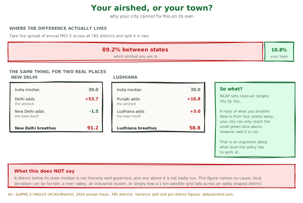
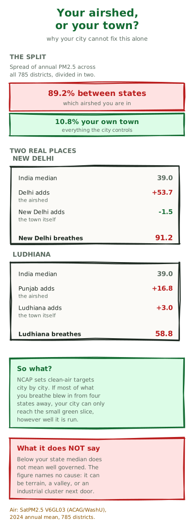
Across all 785 Indian districts, 89% of the difference between one district's yearly air and another's comes from which state it sits in. Only 11% comes from the district itself.
What that sentence actually means
Line up all 785 districts by their yearly PM2.5 and ask why they differ.
Some of the difference is regional. Every district in Bihar reads high; every district in Kerala reads low. Some of it is local. Within Bihar, Patna is not identical to Kishanganj.
Split the total spread into those two parts and the regional part is 89% of it. Knowing which state you are in tells you most of what there is to know about your annual average. Knowing which district within that state adds surprisingly little.
The reason is geography. The Indo-Gangetic Plain is a basin with the Himalaya along its northern edge. The district figures below are the evidence for how much of a city's air is shared with its state: we have not attributed it to specific sources, and we cite no apportionment study for cross-state transport here.
Two real places
Take New Delhi first. The median Indian district reads 39.0 µg/m³ a year. Delhi as a whole sits 53.7 above that, and New Delhi is then 1.5 below its own state's median, so its own adjustment is slightly negative. It ends up at 91.2.
Now Ludhiana. Punjab sits 16.8 above the national median. Ludhiana adds 3.0 on top of that, reaching 58.8.
Ludhiana is dirtier than the average Punjab district. But the part that is distinctly Ludhiana's is 3.0, against 16.8 that arrives with the state. So the question of whose fault the air is has mostly little to do with Ludhiana itself.
Why this matters for policy
If a city's own contribution is a fraction of its total, then a city working alone can only ever fix that fraction. Ludhiana could do everything right and still read close to 56 because Punjab reads 55.8.
This is the argument for airshed-level management: treating the whole basin as one unit with one plan, rather than 131 cities each chasing a separate target. It has been made in Indian policy circles for years, usually in the abstract.
It can be made from India's own district numbers, and now anyone can check it.
Try it: Your airshed, or your town? →
Pick any of the 785 districts. It shows your district's figure, your state's median, the national median, and the split between them, in one sentence.
Where the states stand
| Median district, µg/m³ | |
|---|---|
| Delhi | 92.7 |
| Chandigarh | 61.1 |
| Bihar | 58.3 |
| Haryana | 56.0 |
| Punjab | 55.8 |
| … | |
| Kerala | 22.7 |
| Andaman & Nicobar | 17.9 |
| Arunachal Pradesh | 17.2 |
| Ladakh | 13.9 |
India's own annual limit is 40 µg/m³. The WHO guideline is 5. Thirteen states and union territories have a median district above India's limit. None is anywhere near the WHO figure.
The national median district reads 39.0, which is to say the typical Indian district sits just under the legal limit and roughly eight times the level the WHO considers safe.
What this does not tell you
We want to be blunt here, because the tool is easy to misread as a scorecard.
A district below its state median is not thereby well governed, and a district above it is not badly run. The figure names no cause at all.
If your district reads lower than its neighbours, that could be altitude, a river valley that ventilates, being upwind of the industry, or simply having fewer people. If it reads higher, that could be a cement cluster, a highway, a landfill, or where a one-kilometre satellite grid happened to fall across an oddly shaped boundary.
We can tell you the gap exists. We cannot tell you why, and neither can anyone else from this number alone.
These are yearly averages for 2024, from satellite estimates. They are not today's air and not a forecast. Do not read them against the daily Good/Moderate/Poor bands, and do not take same-day advice from them. For today, use the live dashboard. For the year, use this.
Small states have thin medians. Ladakh has 2 districts. Delhi has 11. Treat those numbers as indicative rather than precise.
Where this came from
Oddly, from a dead end.
A reader sent us a global dataset measuring how ecologically intact land is, and asked whether it explained India's air. It looked spectacular: better correlated with district pollution than anything on this site. Then we compared districts within the same state instead of across the country, and the effect almost entirely vanished. The dataset had been quietly measuring where the Gangetic Plain is.
We did not ship it. But the control that killed it is the finding in this post, so the dead end produced the tool. That story is written up separately in The Dataset That Looked Like Our Best Predictor, including the join bug that nearly had us publish a table built on nonsense.
Air figures: SatPM2.5 V6GL03 (ACAG, Washington University), 2024 annual mean, the same layer the map uses. Every district figure and the variance split are in data/airshed.json, computed by scripts/build-airshed-decomposition.py.