Published: 9 August 2026 | Author: Team JanVayu | Reading time: 7 min
At a conference last week, a reader made a point worth acting on: our headline figures often led with AQI, when PM2.5 is the measure that carries the health consequences.
It is a fair point, and we have changed how the numbers are presented. This post explains why PM2.5 is the right measure to lead with, and what AQI is still good for.
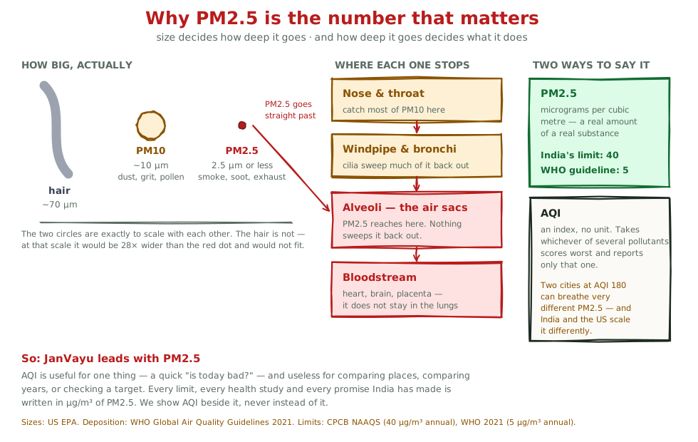
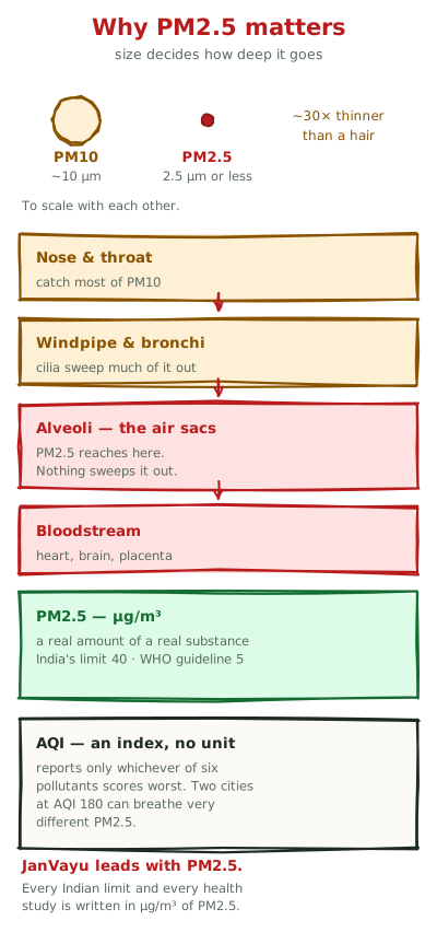
The size is the whole story
Particulate matter is graded by how wide the particles are, in micrometres (µm, a thousandth of a millimetre).
PM10 is everything up to 10 µm: road dust, construction grit, pollen, crushed stone. It is dirty and it is unpleasant and it will irritate your eyes and throat. But it is big. Your nose and throat catch most of it, and the tiny hairs lining your windpipe sweep much of the rest back out.
PM2.5 is everything 2.5 µm and smaller, around thirty times thinner than a human hair. That is small enough to travel past every defence your airway has. It reaches the alveoli, the air sacs where your lungs hand oxygen to your blood, and your body clears it only slowly and incompletely. From the alveoli, the finest fraction crosses into the bloodstream itself.
The two differ in kind: your body can expel one and cannot expel the other.
This is why PM2.5, and not PM10, is the pollutant tied in study after study to heart attacks, strokes, lung cancer, low birth weight, stunted lung development in children and dementia in adults. It is why ambient PM2.5 is credited with roughly 1.72 million deaths a year in India (Lancet Countdown 2025), and why the Air Quality Life Index puts the cost at years of life expectancy rather than days of discomfort.
PM10 matters. PM2.5 is what kills people.
So what is AQI, then?
The Air Quality Index is a translation. It turns several different pollutants into one 0-to-500 number that a person can act on without knowing any chemistry. Here is how it works, and where it goes wrong.
AQI has no unit. PM2.5 is measured in micrograms per cubic metre: a real quantity of a real substance in a real volume of air. AQI is an index. "AQI 180" is not 180 of anything.
AQI reports only the worst pollutant. India's AQI can draw on up to eight pollutants (PM2.5, PM10, NO₂, SO₂, CO, ozone, ammonia and lead). It needs at least three, one of them PM2.5 or PM10, takes whichever scores highest, and reports that one (CPCB, National Air Quality Index, 2014). So an AQI of 180 might be driven by PM2.5, or it might be driven by ozone on a hot afternoon while PM2.5 sits comfortably lower. The number does not tell you which, and two cities showing the same AQI can be breathing very different air.
AQI is not the same number everywhere. India's CPCB scale and the US EPA scale convert concentrations to index values differently, so the same air gives different AQI figures depending on whose formula you use. Aggregators such as IQAir and AirNow use the US scale. When someone compares "Delhi's AQI" with "Beijing's AQI" from two different sources, the comparison is often meaningless.
AQI cannot be averaged over a year. The bands (Good, Moderate, Poor, Severe) describe 24-hour exposure and carry same-day advice: wear a mask, keep children indoors. Applying them to a yearly average makes no sense, because a year is not a bad afternoon.
None of this makes AQI useless. For "should I go for a run this evening?" it is the right tool, and it was designed for that. It goes wrong when it stands in for the measurement on any other question.
What every promise is actually written in
Here is the practical test. Every commitment India has made about its air is written in concentrations (µg/m³) of particulate matter, mostly PM2.5 and PM10, and none is written in AQI.
India's national standard is 40 µg/m³ as an annual mean (CPCB, NAAQS). The WHO guideline is 5 µg/m³ annual (WHO Global Air Quality Guidelines, 2021). The National Clean Air Programme set its reduction targets against particulate concentrations, and index values do not appear in them.
Suppose you want to know whether your city is meeting the law, whether it is getting better or worse, or whether a minister's claim of "20% improvement" holds. AQI cannot answer any of those. Only the concentration can. That is the case for leading with PM2.5: AQI is fine for the daily decision, but it cannot be checked against these promises.
What this looks like on JanVayu
The dashboard describes itself as live PM2.5 in µg/m³, with AQI alongside rather than instead. The city rankings table has always led on PM2.5, with AQI as a secondary column.
The walkthrough decks, which we use at conferences and workshops, now headline "Real-time PM2.5 for 157 cities" (update, 6 October 2026: it now reads "157 Indian cities", since the live feed holds 157 Indian cities plus Beijing, London and Singapore, 160 in all), with a speaker note that paraphrases to: lead with PM2.5, and treat AQI as a derived index, because PM2.5 is the pollutant that does the damage.
The map uses PM2.5 throughout: every boundary is coloured by annual satellite PM2.5 in µg/m³, banded against 5 and 40, never against AQI categories. That is why a yearly figure on the map never carries "wear a mask today" advice.
Ask JanVayu, our assistant, holds a hard rule against mapping an annual mean onto a 24-hour AQI band.
We have not changed the AQI alerts. If you have asked to be told when your city crosses a threshold, a same-day index is the right measure for that, and we will not make a daily warning worse for the sake of consistency.
What to do with this
Three questions are worth asking whenever you meet an air-quality number, on our site or any other.
Which pollutant? When you see an AQI, the useful follow-up is "of what?" If the answer is PM2.5, the number means something about long-term health. If it is ozone or NO₂, it is a different problem with different sources and different solutions.
What is the concentration? A credible source will give you µg/m³ alongside the index. If a dashboard only shows an index, it is either simplifying for a reason or hiding something, and you cannot tell which.
Over what period? A 24-hour figure and an annual mean are not comparable, and the annual one is the one connected to life expectancy. Our map shows both, and keeps them visibly apart, because mixing them up is the most common way air-quality numbers get misused in India.
A note of thanks
This change came from a reader at a conference who took the trouble to say what would make the site more useful. That kind of specific, technical feedback is worth more to us than praise, and we would rather hear it than not.
If you have a point to make about how anything here is presented, tell us.
Sources: Particle sizes and deposition, US EPA and WHO Global Air Quality Guidelines (2021). India's NAAQS annual PM2.5 standard of 40 µg/m³, CPCB. WHO annual guideline of 5 µg/m³, WHO (2021). India's ambient PM2.5 mortality figure of ~1.72 million, Lancet Countdown (2025). Life-expectancy framing, AQLI (2025). India's AQI construction (up to eight pollutants, worst-of reported), CPCB National Air Quality Index methodology.