Published: 9 August 2026 | Author: Team JanVayu | Reading time: 9 min
The map now holds a number for every place in India. That means every place, not only every city: all 983,149 administrative areas the country is divided into, from the 36 states down to the 584,615 villages, and every gram panchayat, block, district, city and ward in between.
That is a lot of map, and it does not explain itself. This post is the manual we should have written first. It covers what the map shows, what the words mean, and what you can find out with it.
The map shows two different things
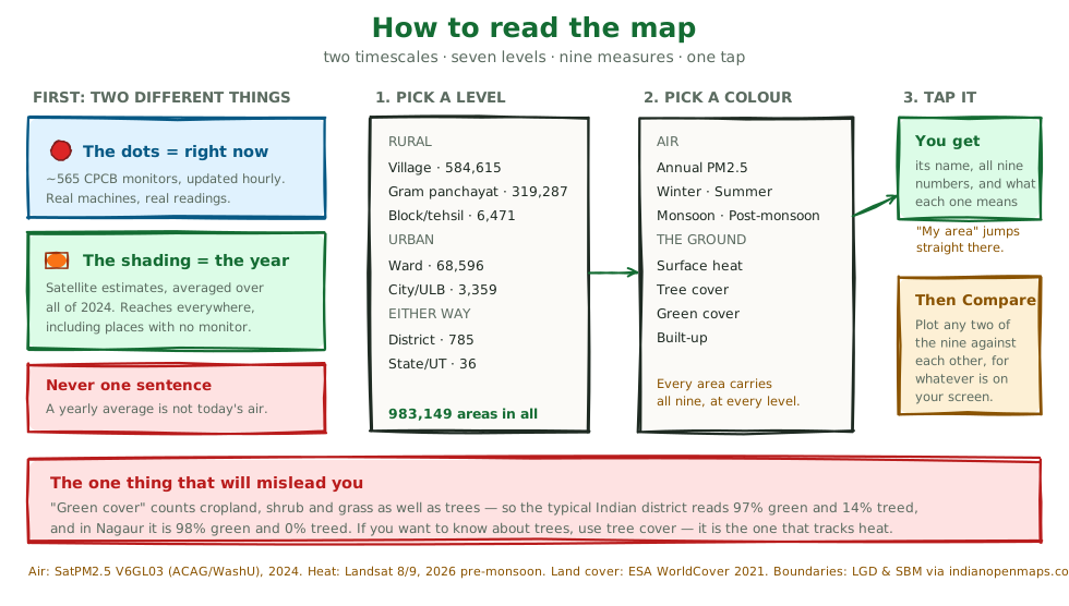
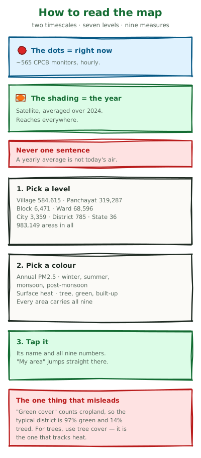
Everything on the map is either right now or over a year. They are different measurements, they answer different questions, and no honest sentence contains both without saying so. Mixing them up is the one real mistake you can make here.
Right now is the coloured dots. These are live readings from real monitoring machines, about 565 continuous CPCB stations, served to us through WAQI. A dot tells you the air at that machine in the last hour or so. Tap one and you get the AQI, the PM2.5 and PM10 in µg/m³, the station's name, and when it last reported.
Over a year is the shaded areas underneath. These are not measurements. They are satellite estimates of what a place breathed across all of 2024, a yearly average.
Why 2024 and not this year? The source product (SatPM2.5 V6GL03) is calibrated against ground monitors before release, and that takes time. As of our last check in August 2026 the newest year we had found published was 2024, with no 2025 grid yet. The lag is the calibration step. There is now a "this year so far" layer that fills the gap for districts. It is a coarser model, corrected against this satellite series and described below, and it is a different instrument, not a newer version of this one. If you want to know about this week, the live monitors are the only honest answer, and they exist only in cities. They cannot tell you whether to go for a walk this evening. The yearly average tells you what living somewhere does to you over years, and that is what shortens lives.
Why have both? India has roughly 565 continuous stations for 1.4 billion people. If we showed only live monitors, most of the country would stay blank. The satellite layer is the only estimate that reaches everywhere, including the village that will never have a machine in it.
So the dots are today and the colours are the year. Everything below is about the colours.
Finding your place with the Boundaries menu
India is divided up more than once, and which division applies to you depends on where you live.
Open Boundaries and you get seven choices.
If you live in a town or city, there are two: City / ULB, the municipal body itself (3,359 of them), and Ward, the individual councillor's ward inside it (68,596 nationally).
If you live in a village or the countryside, there are three. Village is the smallest unit there is, with 584,615. Gram panchayat has 319,287, and most rural governance happens at this tier. Block / mandal / tehsil has 6,471, the level a district administration works at.
Either way, there are District (zila), 785 of them, and State / UT, 36.
Pick one and zoom in. Each level appears at the zoom where it makes sense: states are visible from far out, wards and villages only when you are close. If you have picked a level and see nothing, you are too far away, and the note under the map will say so.
The fastest route is to press My area. It jumps to where you are, at a zoom where the level you picked is drawn.
Then tap any area. You get its name and every number the map holds about it.
What the colours mean
The Colour menu has nine measures, carried by every area at every level. A tenth, "this year so far", exists only for districts, because the model behind it is too coarse for anything smaller.
Air (annual)
The yearly average PM2.5, from satellite. Compare it against two lines that matter. India's own legal limit is 40 µg/m³ a year. The WHO guideline is 5.
About 46 per cent of districts (362 of 785) are above the first, and every district is above the second.
This year so far
"Why 2024?" is the first thing everyone asks, so there is now a second air layer that answers it. It covers districts only, and it is a different instrument.
It comes from CAMS, the European atmospheric model, which publishes continuously and therefore covers 2026. On its own it cannot be compared with the satellite numbers beside it. It is a model rather than a satellite retrieval, and its cells are about 40 km across. Both cover 2024, though, so they can be checked against each other. Across the districts where both had a value when we fitted the model (758 then; the September refresh covers all 785, with a slope of 0.8276 and an intercept of 12.867), CAMS tracks the spatial pattern well (r = 0.91) while reading about 7 µg/m³ low everywhere. A steady offset is the correctable kind of error, so we fit the model to the satellite series on 2024 and apply that correction to 2026.
Tested on districts held out of the fit, the corrected figure lands within 3.1 µg/m³ (absolute error) for half of them and 8.5 for nine in ten. That is the accuracy this layer has, and it is why the layer stops at district level. A 40 km cell cannot resolve a ward, and colouring one would invent detail the model does not have.
It has its own menu entry and its own label. We never merge it into the annual layer or quote it as if it were the same measurement. It is rebuilt on the 3rd of each month, so the window grows as the year does.
Air by season
The same year, split four ways: winter (Dec–Feb), summer (Mar–May), monsoon (Jun–Sep) and post-monsoon (Oct–Nov).
Most people should look at this setting, because an annual average hides how bad the bad months are. Villages in West Tripura average 54.1 µg/m³ across the year, which sounds like one steady problem. Split it up and the monsoon reads 24.2 while winter reads 106. That is more than four times, and nobody experiences 54. They experience clean air in July and a wall of smoke in January.
The colours stay on the same scale between seasons on purpose. When you switch from monsoon to winter and the map turns red, the air has changed, not the scale.
Surface heat
How hot the ground gets, from Landsat satellites, averaged over the pre-monsoon season, the hottest and clearest part of the year.
This is not the weather forecast. It is the temperature of the land surface itself: tarmac, roof, bare soil, field. It runs well above what a thermometer in the shade says, so a 50°C reading here does not mean 50°C air.
It shows which neighbourhoods bake, and it is where a treeless colony and a leafy one, two kilometres apart, stop looking alike.
Tree cover, green cover, built-up
All three come from ESA WorldCover 2021, which classifies the whole planet at 10-metre resolution.
This is the one place the map can mislead you, so it is worth a minute.
Tree cover is tree canopy and nothing else. Green cover is anything vegetated: trees, but also shrub, grass, wetland, and cropland. Built-up is buildings, roads and other hard surface.
In rural India, "green cover" is mostly farmland. The typical Indian district's villages are 97% green and 14% treed. In Nagaur, Rajasthan, the typical village is 98% green and 0% treed.
Both numbers are true, but only one means what people mean when they ask "is there any greenery here". If you want to know whether there are trees, look at tree cover. If a place shows deep green on the green-cover layer and near-white on tree cover, you are looking at fields, not forest.
That is why tree cover has its own layer instead of being folded into green cover. The two answer different questions, and only tree cover tracks heat. The analysis is here.
Three things you can find out
1. When is the air worst where I live?
Set Boundaries to your level and Colour to air, then step the season menu through winter, summer, monsoon and post-monsoon and watch your area change.
For most of north India the worst months are post-monsoon and winter, and the size of the swing is the story. Amritsar's villages average 40.1 µg/m³ in the monsoon and 101.3 after it. Those are the same fields, houses and people, and two and a half times the pollution for a couple of months every year.
Knowing your own months is worth more than knowing your annual number. It tells you when to press for action, and when the air in a press release was measured.
2. Is my area hotter than the one next to it, and why?
Set Colour to surface heat and zoom in until wards or villages appear. Then switch to tree cover and look at the same screen.
Across India the two track each other: the treeless places are the hot ones. In Maharashtra, villages in Akola have about 1% tree canopy and ground temperatures averaging 53.9°C, while villages in Sindhudurg have 71% canopy and 43.5°C. That is ten degrees cooler in the same state.
Be careful with that comparison. Sindhudurg is coastal and wet, Akola is inland and dry, and rainfall and altitude do a great deal of the work. The map shows you a pattern, not a proof. It is most useful close up: two wards in one city, same climate, same rainfall, one with trees and one without. There the difference comes from the ground, not the geography.
3. Does what I suspect hold here?
Under the map there is a Compare panel. Pick any two of the five year-round measures (annual PM2.5, surface heat, tree, green and built-up cover), press Compare, and it plots every area currently on your screen against each other, with the strength of the relationship.
It answers questions about your place, not the country. Whatever is on screen is what it uses, and it tells you how many areas that was. Zoom somewhere else, press it again, and you get a different answer. "Does tree cover cool things down in my city" is a different question from "does it nationally", and until now only the second had an answer.
Two overlays worth knowing about
Schools and Health centres put a dot on every school (UDISE) and every health centre (Bharatmaps) in view, over whatever you have coloured the map by. They answer a question shading cannot: who is actually breathing this. A dark-red ward is an abstraction. A dark-red ward with forty schools in it is an argument.
What this map cannot tell you
It cannot tell you about the kiln next door. The satellite air estimate is roughly one kilometre across. It is good at "what does this district breathe over a year" and blind to a single smelter, crusher or highway at the end of your street. Byrnihat, a small industrial pocket that topped IQAir's 2024 global city ranking (the 2025 report, published in March 2026, puts Loni, at 112.5 µg/m³, at the top of India's list), reads far lower here than its own ground station does. If you live beside a point source, this map understates your air.
It cannot tell you about today. Nothing in the coloured layers is a forecast or a current reading. If someone quotes a yearly average as today's air quality, they are wrong, and if we ever do it, tell us.
Land cover is from 2021. Construction since then does not appear.
Some areas have no value at all, and are drawn uncoloured rather than filled with a guess: 143 villages have no land cover, 749 have no heat reading, and a few dozen wards likewise. These are slivers and odd shapes too small for the satellite grid to resolve. A grey area means "we don't know", never "zero".
Boundaries are as good as their sources. Ward boundaries carry whatever delimitation each municipality last uploaded, which is not the same year everywhere. A handful of cities, Siliguri among them, are still missing because no open source has published them.
Where the numbers come from
Every figure on the map is public data anyone can check.
Live air comes from CPCB monitors, via WAQI. Annual and seasonal PM2.5 come from SatPM2.5 V6GL03, Atmospheric Composition Analysis Group, Washington University in St. Louis: satellite estimates calibrated against ground monitors, for 2024, under CC BY 4.0. "This year so far" (districts) comes from CAMS, the Copernicus Atmosphere Monitoring Service, via the Open-Meteo air-quality archive. It is a ~40 km model, calibrated against the SatPM2.5 series on 2024 and rebuilt monthly.
Surface heat comes from Landsat 8 and 9, USGS, 2026 pre-monsoon. Tree, green and built-up cover come from ESA WorldCover 2021, CC BY 4.0. Boundaries come from the Local Government Directory and Swachh Bharat Mission, republished via indianopenmaps.com, plus West Bengal AMRUT and Living Atlas ward layers.
The full method, with the coverage figures and known limits for every layer, is in The Boundary Map.
Try it on your own place
Open the map, press My area, set Boundaries to Ward if you are in a town or Village if you are not, and tap where you live.
Then switch the season to winter and look again.
If something reads wrong for a place you know well, such as a boundary in the wrong spot, a misspelt name or a number that cannot be right, tell us. Local knowledge is the one input a satellite does not have.